

The mad dash to bury the Data of the "Safe and Effective" Coivd-19 "vaccines" and their aftermath...
How long can the data be buried while the rats leave the sinking ship ; Health Ministers, State & Country leaders, heads of Health Regulatory Authorities, Investors and Vaccine Stakeholders alike ?


That there is more death can no longer be hidden.
Now the task of the Vaccine stakeholders, who now find themselves with much more at stake than there precious vaccines, is to convince the world that the extra deaths are to be expected.
Australian Increased Deaths
Since the Covid-19 “Vaccines” Roll-out:
Data Examined:
Australian Bureau of Statistic - Deaths
Calendar Years 2015,2016,2017,2018,2019,2020,2021,2022 and to June 25th
The Specific Data File Used was downloaded from : https://mortality.org/Data/STMF
Data file Link: (Click here)
This file was created from Australian Bureau of Statistics (ABS) Data
Data file Link: (Click here).

Findings:
Significantly More Deaths for a FIXED Population Comparison AFTER the Covid-19 Vaccines Roll Out.
Note 1: ABS data is in weeks -Some years have 53 weeks and others 52 weeks
The Data in weeks was evenly divided into days for each week enabling the layering of Calendar years 365 Days for each Calendar Year
Note 2: Covid-19 “Vaccinations” in Australia only started in February 2021
See: https://covidlive.com.au/report/daily-vaccinations/aus#2021
Note 3: The Red line in the above graph represents the average number of deaths over the years 2015 to 2020. It simply adds the deaths of each calendar day and divides by 6 to get an average daily death on the calendar day (Pre -Covid-19 Vaccinations)
Note 4: Population Growth Factored In
When Comparing Deaths per day over two different periods for an “apples for apples” comparison we need to allow for the different populations during those different periods.
For the Red Line - Pre Covid-19 “Vaccinations” years we took the average population during those years using 2020 2019 2018 2017 2016 2015 which came to 24,768,787
For the Post Covid-19 “Vaccinations” years the line is divided into 3 different coloured sections.
The Green Line represents the Calendar days up to day 81 for 2022 and 2023 because in 2021 there were no significant Covid-19 “Vaccinations” Numbers until day 82
The average population for 2022 & 2023 came to 26,308,262 so the average data for this section of the line was (reduced) multiplied by 0.941 (24,768,787 / 26,308,262)
The Yellow Line represents Calendar days from 82 to 182 for 2021 2022 2023 because we have Covid-19 “Vaccinations” and deaths data for these days.
The average population for 2021 2022 & 2023 came to 26,179,204 so the average data for this section of the line was (reduced) multiplied by 0.946 (24,768,787 / 26,179,204)
The Blue Line represents the Calendar days from 182 to 365 for 2021 and 2022 because we do not have 2023 deaths data yet for these Calendar days
The average population for 2021 & 2022 came to 26,049,251 so the average data for this section of the line was (reduced) multiplied by 0.951 (24,768,787 / 26,049,251)
DISMISSING MINOR FACTORS
Vaccine Stakeholder friendly “Data Burial Experts” will try to muddy the waters here and say that different age demographics will have an impact when comparing the different data periods.
“Ah but you don’t understand the relationship between population age structure and mortality”
First we translate this statement to the vaccine stakeholder’s inference; the inference being:
“The mortality rate is expected to increase (from a changing population age structure) anyway; hence the extra deaths you see are from this changing population age structure factor that occurred only after the vaccines roll-out.”
Well… did the mortality rate increase prior to Covid-19 “Vaccines” with the six (6) years consecutive RAW ABS data on deaths ?
Answer: No; ABS data actually shows a clear decrease in Australian’s Mortality rate (While the population increased).

To drive the point home even harder (and people’s understanding of “the relationship between population age structure and mortality” and their understanding of the relationship between covid-19 “vaccines” timing and mortality)

After Covid-19 “Vaccines” the rates of Australian’s dying took a sharp turn up
(As the population continued to increase) .
Population Data from https://www.populationpyramid.net/australia
2015, 2016, 2017, 2018, 2019, 2020, 2021, 2022
These graphs wash away this specific Data Burial Experts’ “mud”.
They also help us see, clearer than ever, that the “changing age structure” for Australia, over Six (6) consecutive Pre Covid-19 “vaccine” YEARS period reflected a declining death rates for Australians. They help us see over two (2) consecutive Post Covid-19 “vaccine” YEARS the death rates for Australians took a sharp turn up.
Graphs data can be found in the Excel File Included in this Substack
With the introduction of Covid-19 “Vaccines” will we see the Aging Australian Population Trend Reverse and WHO would want that ?
The Following Graph Summarizes the before and After Covid-19 “Vaccine” YEARS Deaths in Australia.

The above chart takes eight (8) consecutive years of ABS Deaths data.
The line that starts Green and ends Pink is the RAW data from the ABS ; a record of each year’s actual Deaths.
The line that starts Blue and ends up Brown is the line you would get if you applied the rates of deaths from the given year (ABS Data) to a population that is the average of the (8) consecutive years charted.
Method: Establish the average/mean Population for the years:
2015, 2016, 2017, 2018, 2019, 2020, 2021, 2022 = 25,088,903
There can be no argument that the upswing in deaths is due to the population increasing.
Similarly there can be no argument that the upswing in deaths is due to “a misunderstanding of the relationship between population age structure and mortality”.
DUCKING FOR THE COVER OF COVID-19 DEATHS THEMSELVES
This cover is quickly and easily ripped away from the Vaccine-Stakeholder-Friendly “Data Burial Experts”.
The burning question…
To what extent can the increased deaths (and the associated increase rates of death) be attributed to the effects of SARS-CoV-2 spike protein from a “natural” infection as compared to the much longer lasting and much wider systemic introduction of SARS-CoV-2 spike protein from prior injections of mRNA “vaccines”.

Link: “Spikeopathy”
A) Most of Australia’s Covid-19 Cases Occurred AFTER the Majority of the Population had received mRNA and/or adenovector DNA vaccines. Hence most of the Deaths from the effects of SARS-CoV-2 spike protein have TWO very real sources of this protein and one of these sources is MUCH more systemic and longer lasting in “nature”.
Australian cases of Covid19 Exploded AFTER the roll out of Covid-19 “Vaccines”
The following chart demonstrates that the vast majority of any “SARS-CoV-2 spike protein” related deaths occurred after the roll out of “vaccines” that introduced SARS-CoV-2 spike protein created from genetic code in mRNA and adenovector DNA vaccines
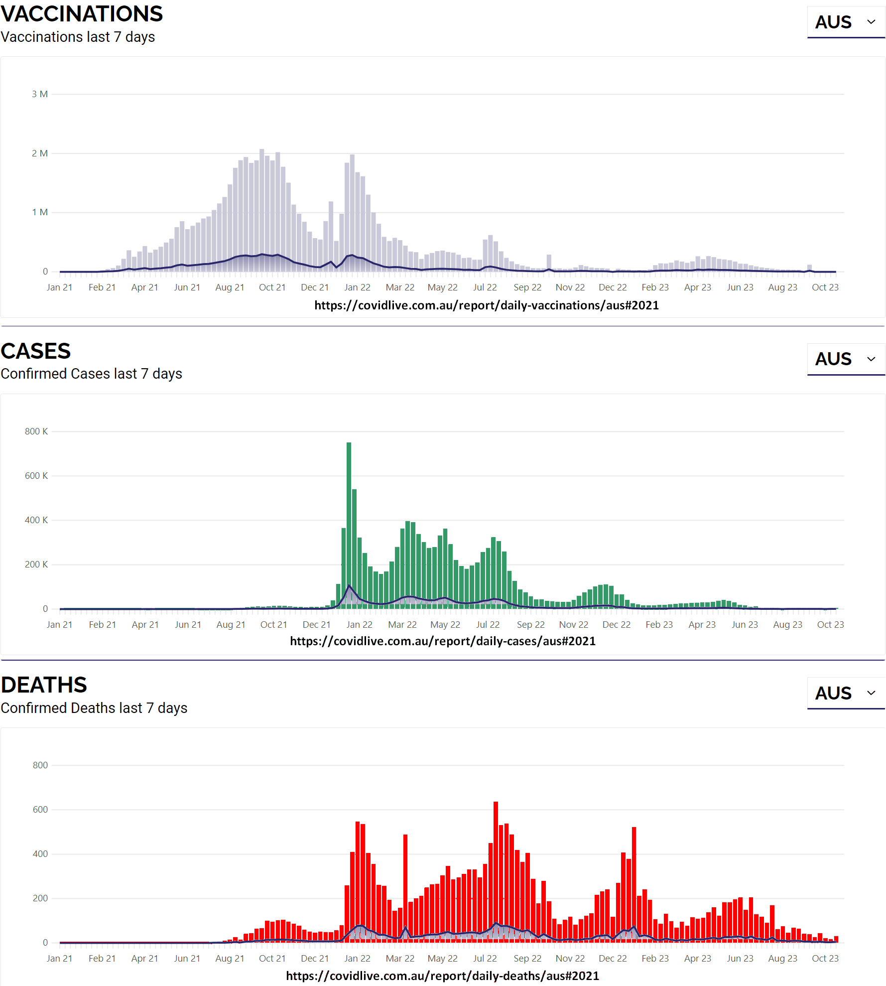
Links: The Vaccine Doses | The Case Numbers |The Deaths Numbers | Data Validation
B) Is it any wonder that Covid-19 Cases Exploded after the “Vaccine’s” roll out ?
Amazon Book - What’s in the Pfizer Documents - suggest “read sample”
See excerpt below:

The Following Video Link Goes into more detail

What’s in the Pfizer Documents? Naomi Wolf
C) Massive Cleveland Study of 51,000 Health workers
"Results….
The risk of COVID-19 also increased with time since the most recent prior COVID-19 episode and with the number of vaccine doses previously received.”

See Trusted News Initiative “Fact Check” on this one…Click: FactCheck.org

How odd ? …the “President and Chief Executive Officer of Thomson Reuters” is ALSO Pfizer Board Member : James C. Smith :Proof: Pfizers' Link. He also sits on the board of the WEF’s Partnering Against Corruption Initiative, and is a member of the WEF’s International Business Council.
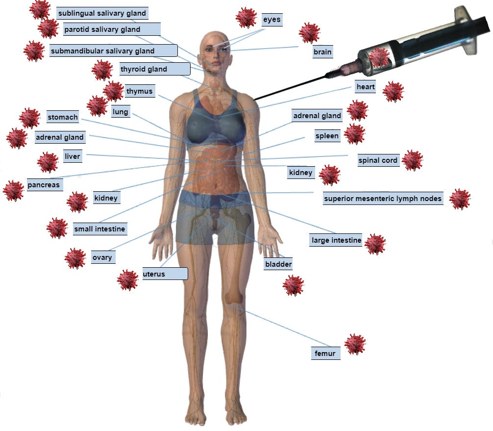
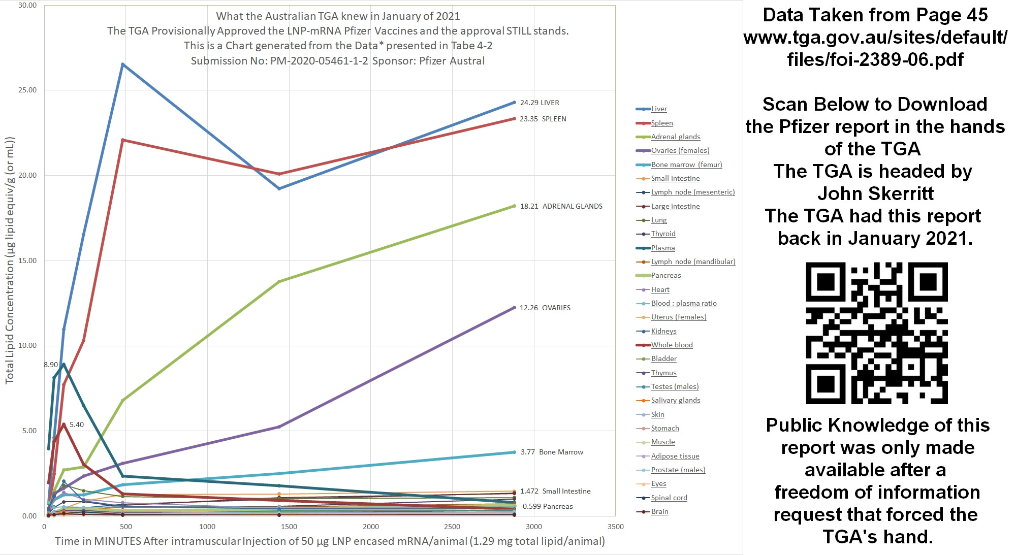
D) Most Doctors certifying Australian Deaths have no idea that the mRNA vaccines are more accurately described as Lipid Nano Particle Synthetic messenger RNA Genetic Instruction products (Covid-19 LNPSnRNAGI vaccines) that have the following wild cards:
i) A delivery system of highly inflammatory Lipid Nano Particles (LNP)
ii) An Uncontrolled body wide biodistribution of the LNPs
iii) The LNPs carry Genetic Instruction in the form of synthetic messenger RNA
iv) The synthetic nature of the messenger RNA carries the following known risks
a) Synthetic messenger RNA have an uncontrolled extended life of protein producing instructions that is ORDERS OF MAGNITUDE longer than nature’s messenger RNA.
Life, as it has evolved for mammals, has a natural off switch for the protein producing messenger RNA it creates that is limited to two days and usually a lot shorter.
b) Synthetic messenger RNA produced with warp speed indemnity has fragmented genetic instructions that come from a human factory environment compared to natural messenger RNA that is produced deep in the Nucleus of our bodies cells with a purity beyond comparison with that of a Pfizer or Moderna laboratory or manufacturing facility.
c) With the uncontrolled biodistribution of Synthetic messenger RNA there is an endless combination of extra protein producing burdens throughout the body and on its various cell types already dedicated to maintaining a delicate system and schedule of producing natural proteins such as hormones and enzymes; critical for the healthy functioning of our body.
v) The genetic instructions of the Synthetic messenger RNA are instructions to produce a known antigen (The Covid-19 Spike Protein) and it is a known cause of vasculitis and autoimmune reactions. Combining this instruction with an uncontrolled biodistribution is a potential recipe for disaster;
a disaster that will likely show itself in deaths and hospitalizations when regulatory authorities fail and the avalanche of Data is compiled.
vi) No long term safety data. Given the combinations of what is uncontrolled, unknown and divorced from the bodies natural balance, to achieve even remotely sufficient safety data would take a millennium to obtain; even with billions of guinea pigs.
Therefore, when a Doctor is challenged on the certification of death where he/she has stated the underlying cause is Covid-19 and it is proposed that the underlying cause was more likely from the properties and mechanisms of a far more common Covid-19 mRNA “vaccination” than a Covid-19 infection it is almost certain that Doctor could not dismiss such a challenge.
Would any of these Doctors assigning the underlying cause of death be familiar with the mind mesmerizing breadth of Adverse Reactions reported to the Database of Adverse Event Notifications (DAEN) it is not an easy system to Navigate; so if there are any Doctors or Family members out there rethinking the underlying cause of death listed on a death certificate (as being unrelated to Covid-19 “Vaccines”) here is a searchable excel file and a PDF generated for mRNA related reports as of May 8th 2023; sadly the list has only grown since then.
Note at the time of writing this substack there were over 68.5 Million Doses of Covid-19 Vaccines recorded in Australia and under 12 Million Confirmed “Cases”
Again;
For Data Transparency and for others to expand upon - the above Australian Deaths related charts were generated along with others charts not posted using the below Excel File.
Steps in the Excel File for those interested:
The first sheet is the ABS RAW data for Australia
As usual, the data is not presented in a way that can easily be put into a simple time line so using different sheets along the way the data is arranged until you we to the sheet named :“Charting it to make it obvious”
1)- Raw ABS Data
2)- Focus on Deaths of Both Sexes (Not looking at Male versus Female)
3) – Make Columns of Yearly Data – which is weekly deaths
Here we see ABS is reporting in weeks and occasionally has 53 weeks in a year
4) Convert Weekly Data to Daily data
Having years with 53 weeks and 52 weeks presents a difficulty to overlay different years on the same chart.
This is solved by breaking each weekly figure by 7 to give us a daily death for that day
Then arrange the data in even layers of 365 Days (Years)
Here a “nothing burger” assumption that week 1 of 2015 data will start at January 01st
5) Chart the deaths to look for obvious trends – And they are very obvious
6) Make allowance for increased populations when looking at averages of deaths in the years preceding Covid-19 “vaccinations” and After Covid-19 “Vaccinations”
The writing appears to be on the wall with literally 1000’s of law suits lining up for the “vaccine” companies around the globe. If the contracts providing vaccine companies with indemnity don’t hold up the question to the investors .. is being a vaccine shareholder safe and effective ?
See:


SMS and email share URL : https://tribeqr.com/v/safeandeffective

https://x.com/tniwef/status/1716443679651406143
Disclaimer: All content is presented for educational and/or entertainment purposes only. Under no circumstances should it be mistaken for professional advice, nor is it at all intended to be taken as such. The contents simply reflect current newsworthy items on Covid that are freely available. It is subject to error and change without notice. The presence of a link to a website does not indicate approval or endorsement of that web site or any services, products, or opinions that may be offered by them.
Neither this Substack nor any of its principals or contributors are under any obligation to update or keep current the information contained herein.
Although the information contained is derived from sources which are believed to be reliable, they cannot be guaranteed.
Disclosure: We accept no advertising or compensation, and have no material connection to any products, brands, topics or companies mentioned anywhere on this post.
Fair Use Notice: This post may contain copyrighted material the use of which has not always been specifically authorized by the copyright owner. This post is making such material available in efforts to advance understanding of issues of social significance. We believe this constitutes a ‘fair use’ of any such copyrighted material as provided for in section 107 of the US Copyright Law. In accordance with Title 17 U.S.C. Section 107, the material on this site is distributed without profit. If you wish to use copyrighted material from this site for purposes of your own that go beyond ‘fair use’, you must obtain permission from the copyright owner.
The data is fascinating. I have used oecd-stat data to compare NZ/OZ and Sweden. NZ and OZ remain in perfect concordance since 2020 (excess weekly death above the 2015 - 19 mean). Something else altogether is taking place in Sweden.
https://drlatusdextro.substack.com/p/excess-deaths-nzzzz-ozzzz-and-sweden
Great summary of evidence. How many doctors continue to ignore this? And would you trust them with your healthcare if they do ignore it?